CSS Parallax Scroll Effect for All Modern Browsers
 CSS
CSS This tutorial will teach you how to create a parallax scroll effect with pure CSS that works magnificently in all modern desktop and mobile browsers, including the latest versions of Chrome, Firefox, Edge, Opera, Safari, Chrome for Android, and Chrome and Safari for Mac.
What is a Parallax Scroll Effect?
Parallax scrolling is a technique used to make background images appear as if they're moving slower than their surrounding foreground elements when scrolling through a web page.
In this case, the illusion is accomplished by defining a set of 3D perspective and layer transformation rules in CSS that will be output in a 2D format on the screen.
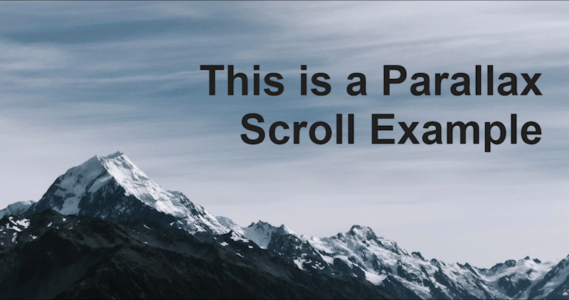
The result is a smooth scroll with the background image moving at half the speed of its surrounding content:
The HTML Code
The below code example represents the markup needed for the background image, page title, and surrounding content:
<div class="parallax">
	<h1>This is a Parallax Scroll Example</h1>
</div>

<div class="content-outer">
	<div class="content-inner">
 	<p>Paragraph 1</p>
		<p>Paragraph 2</p>
		<p>Paragraph 3</p>
		<p>Paragraph 4</p>
		<p>Paragraph 5</p>
	</div>
</div>
The .parallax element is the container where the background image will be stored using a pseudo-selector, and also where the page title will be displayed.
The .content-outer and .content-inner elements contain the page content that exists below the background image and page title.
The CSS Parallax Scroll Rules
The html and body elements
For the CSS rules, we'll start by removing all padding and margin spacing around the edge of our document. This is just to clean up the display:
html, body {
	padding: 0px;
	margin: 0px;
}
Second, we'll remove all horizontal and vertical scrolling ability from the html selector by setting its overflow to hidden. This is required for the effect to work correctly:
html {
	overflow: hidden;
}
And, third, we'll set the body width and height to the size of the viewport. We'll also enable vertical scrolling in case the page contents exceed the viewport height (which they will in this example) while keeping the horizontal scroll disabled.
We'll add a perspective rule to give the element a 3D-space by adjusting the distance between the user and the element on the Z-axis. This output doesn't affect the element itself, only its child elements and how they will be displayed.
We'll then use the transform-style rule with a value of preserve-3d to ensure that the child elements of body will maintain its 3D position:
body {
	width: 100vw;
	height: 100vh;
	overflow-x: hidden;
	overflow-y: auto;
	perspective: 1px;
	-webkit-perspective: 1px;
	transform-style: preserve-3d;
	-webkit-transform-style: preserve-3d;
}
The parallax element
Now we'll set rules for our .parallax element, the container that will house the background image displayed on the screen, as well as the page title.
Here, we set the element's size to 100% of the viewport width and height so that it covers the entire browser window.
Setting its position to relative ensures that the background image positioning will be retained to its parent's boundaries.
And, again, we're setting transform-style to preserve-3d to ensure that this container maintains its 3D positioning, as well:
div.parallax {
	width: 100vw;
	height: 100vh;
	position: relative;
	transform-style: preserve-3d;
	-webkit-transform-style: preserve-3d;
}
Adding thetransform-stylerule to the.parallaxelement was required for this effect to work properly in Firefox. This is because Firefox doesn't know to maintain 3D transformation rules within additional child elements and must be instructed to do so. You could also set this value to inherit for the same outcome.
The parallax pseudo-element
Now, we have the .parallax:after pseudo-element that provides the rules for our background image and how it will be positioned in the .parallax container:
div.parallax:after {
	background-image: url("/bg.jpg");
	background-repeat: no-repeat;
	background-position: center;
	background-size: cover;
	position: absolute;
	top: 0px;
	left: 0px;
	right: 0px;
	bottom: 0px;
	z-index: -1;
	content: "";
	transform: translateZ(-1px) scale(2);
	-webkit-transform: translateZ(-1px) scale(2);
}
Here, we've set the background image URL and its position within the .parallax element. The positioning must be absolute and centered, which is accomplished by setting the top, left, right, and bottom rules to 0px. This sets the bounding box for the element and instructs the browser to fill all available space with the contents of that element.
Next, we've created a negative z-index value to ensure that there is no overflow of content from other elements within the page, and to slow down the scroll speed which we'll also accomplish with our next CSS rule.
Setting negative Z values with the translateZ() property ensures that the scroll speed will be slower by zooming out from its original position on the Z-axis. We then provide depth correction with the scale() property, doubling the background image size so it renders at its original size for the user.
The scale factor is calculated as((translateZ * -1) + 1) / perspective. So, if our viewportperspectiveis set to 1px and we translate an element -1px along the Z-axis like we have in this example, the correctionscalefactor would be 2.
Safari and iOS Workaround
The caveat with Safari and iOS browsers is where the content below the .parallax element overlaps the background image.
Generally, with the other browsers, you could set a CSS rule of overflow: hidden to the .parallax element to correct this issue. But, with Safari and iOS browsers, we need to take a different approach.
This can be corrected by simply increasing the perspective value of the content below the .parallax element to 2px, 1 pixel larger than the .parallax element itself:
div.content-outer {
	width: 100%;
	background-color: white;
	perspective: 2px;
	-webkit-perspective: 2px;
}
The content will appear scaled as normal to the user but tricks the browser into thinking the content below the .parallax element is actually higher in the Z-axis, and therefore covers up the background image as needed.
Conclusion
The tutorial explained how to create a parallax scroll effect with CSS in all modern browsers using a single set of rules.
You can download the complete source code from my GitHub repository. This codeset includes the assets from the examples above and will allow you to play around with different values as needed to further understand how each of the CSS rules works and interacts with each other.
Written by: J. Rowe, Web Designer & Developer
Last Updated: March 18, 2024Created: December 06, 2020