10 Awesome CSS Tricks Every Web Designer Should Know
 CSS
CSS Some CSS solutions can be tricky. This quick guide will outline some of the most common CSS scenarios, and their solutions that will turn you into a CSS pro.
All of the CSS tricks you'll find here are very useful, and even downright cool!
1. Responsive Design
These days, responsive design is probably the most important design element to include in your CSS styling. Mobile device usage has surpassed the 50% mark, meaning more people are using mobile devices like cell phones and tablets instead of laptops and personal computers, so it's best practice to create styling rules for all device sizes.
Here's a sample of an effective responsive design technique with pure CSS:
div * {
	box-sizing: border-box;
}

.row:after {
	content: "";
	clear: both;
	display: table;
}

[class*="col-"] {
	width: 100%;
	padding: 10px 15px;
	float: left;
}

.col-1 { width: 8.33%; }
.col-2 { width: 16.66%; }
.col-3 { width: 25%; }
.col-4 { width: 33.33%; }
.col-5 { width: 41.66%; }
.col-6 { width: 50%; }
.col-7 { width: 58.33%; }
.col-8 { width: 66.66%; }
.col-9 { width: 75%; }
.col-10 { width: 83.33%; }
.col-11 { width: 91.66%; }
.col-12 { width: 100%; }
This code creates a 12-column, horizontal grid you can use to evenly space content on your pages. Two columns in a single row would each use the .col-6 class, while three columns in a single row would each use the .col-4 class, and so on.
2. Center Aligning HTML Elements
One of my most commonly used CSS tricks is center aligning HTML elements. Long gone are the days of applying a quick center tag to center align content. It's the 21st century, and this CSS trick will do what you need.
When center alinging text, all you need to do is define a text-align property and set it to center. Pretty straightforward, right?
Center aligning HTML elements is a bit more involved than that. Let's assume that you have a div element smaller than the width of its parent container and you want to center it horizontally. This block of code would take care of that for you:
#my-div {
	width: 100px;
	margin: auto;
	display: block;
}
We've set the width of the div element to 100px, and a display type of block. margin: auto does the heavy lifting of calculating an even center on both left and right sides of the div element, centering it automatically.
3. Vertically Aligning Content Within an HTML Element
There may be cases where you'd also need to center content within an HTML element vertically. This CSS example shows how you can accomplish vertical alignment:
.vert {
	height: 200px;
	background-color: #13b5ea;
	color: white;
	text-align: center;
	padding: 0px 25px;
	display: flex;
	align-items: center;
}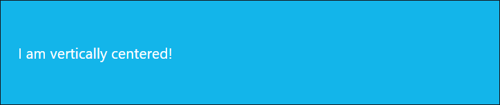
CSS Flexible Box Layout, or Flexbox, is a CSS3 web layout model allowing responsive design elements within a container to be automatically arranged depending upon screen size.
4. Overriding Existing Styles
Say you have a single header tag on multiple pages throughout your site, but you want certain headers to display in a different color. You could do so by overriding the existing styling method using the !important override rule:
h1 {
	color: blue;
}

div.section h1 {
	color: red !important;
}
All h1 header tags will be blue on all pages except for ones that are nested within a div tag with class section.
This should be used sparingly. If you add the !important rule to every CSS rule in your code, things could get messy quickly. It's best to use this rule only when necessary.
You can read more about CSS specificity and the !important rule here.
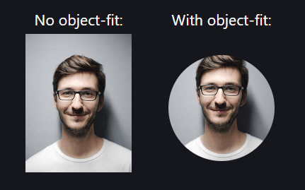
5. Stretch and Center Images
This allows you to stretch and center an image within a div tag so the image inside the container stretches to each edge without skewing the image:
div.photo {
	width: 100px;
	height: 100px;
	border-radius: 50% 50% 50% 50%;
	-moz-border-radius: 50%;
	-webkit-border-radius: 50%;
	overflow: hidden;
}

div.photo img {
	width: 100%;
	height: 100%;
	object-fit: cover;
}
The .photo class' container creates a rounded edge surrounding the photo with the border-radius property and hides the excess display outside the container by setting the overflow property value to hidden.
This is especially useful for tiled images or profile photos. Here's a quick example to illustrate how it could work with a profile photo:
6. Link States
There are four main pseudo-classes you can use to control link states.
A CSS pseudo-class is a keyword added to a selector that specifies a state for that particular element.
a:link {
	color: #ff0000;
}

a:visited {
	color: #00ff00;
}

a:hover {
	color: #ff00ff;
}

a:active {
	color: #0000ff;
}:link: styling for an unvisited link:visited: styling for a visited link:hover: styling for a mouse hover link:active: styling for a selected / clicked link
7. More on the :hover Selector
You can add a :hover selector to any HTML element, allowing you to add additional styling to an element that a mouse cursor hovers over:
div.text {
	color: blue;
}

div.text:hover {
	color: red;
}
Here, we're setting the font color of the .text class element to blue. And when you hover over the element with your mouse, the font color changes to red.
You can also assign transitions when hovering over elements:
div.text:hover {
	color: red;
	transition: 0.25s all ease-in-out;
}
This will fade the color from blue to red on mouse hover, completing the transition in a fourth of a second, and will be repeated every time you hover the mouse cursor over the element.
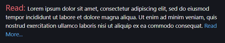
8. :before, :after, and content
The :before and :after selectors work similarly, and both use the content property for content placement within the selector, so I've combined them for this next part.
#my_div {
	width: 100%;
	font-size: 12pt;
	color: white;
}

#my_div:before {
	font-size: 20pt;
	color: red;
	content: "Read: ";
}

#my_div:after {
	color: blue;
	content: "Read More...";
}
Here, we're creating a div element with ID my_div, and a white 12pt font. The :before selector defines the text "Read: " that will be prepended to the content in the element at a red 20pt font, and the :after selector defines the text "Read More..." that will be appended to the content in the element with a blue font color.
Here's how it will look:
9. Applying CSS to Multiple Selectors or Classes
If certain HTML elements of your page or screen share the same styling features, you don't have to define each set of rules separately. You can separate each of your selectors or classes in a comma-delimited list before defining your CSS rules:
div, .content, .sidebar {
	background-color: black;
}
10. Truncating Strings With CSS
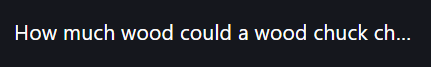
One of the most common scenarios I've run into over the years of web design is text overflow on a particular element. Thankfully, with CSS, there's an easy solution to prevent your text from dropping to multiple lines when this isn't the desired result:
.truncate {
	width: 300px;
	white-space: nowrap;
	overflow: hidden;
	text-overflow: ellipsis;
}
The container's width is set to 300px to illustrate the text truncation. Setting the white-space property to nowrap tells the browser to never push the text to a new line. And the text-overflow property is set to add an ellipsis to the end of the first line, successfully truncating the text:
Conclusion
There are many effective CSS tricks and techniques you can use in your web projects. These were just among the handful that I have used regularly throughout multiple projects and will use again in projects to come.
Written by: J. Rowe, Web Designer & Developer
Last Updated: October 07, 2020Created: April 21, 2020