CSS Filters: An Online Photo Editing Playground
 CSS
CSS At this point, you're probably familiar with photo editing software like Photoshop which offers a vast library of different filters and effects at your fingertips. These tools have proven worthy in the desktop application world, and now you can do many of these filters and effects on the web.
CSS filters have gained much popularity over the years as many of the modern-day browsers now support them. These filters range from blur effects to brightness control, contrast, color shifting, and more, providing an arsenal of effects for online photo editing right at your fingertips.
In this tutorial, we'll go over the details of each filter, how to use them, and how to effectively build them into your own applications. I'll even provide you with free access to use and download a custom online photo editor I created from scratch so you can see how it works and play around with the different filters, individually and coupled.
What are CSS Filters?
CSS filters allow you to assign one or more filter effects to any given images, backgrounds, or borders within your web pages. The CSS filter property is the property that you use to define every given filter within your CSS code for your elements or images within your web pages.
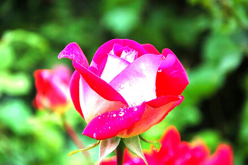
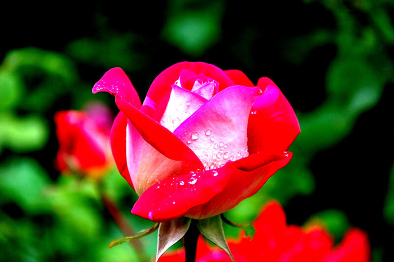
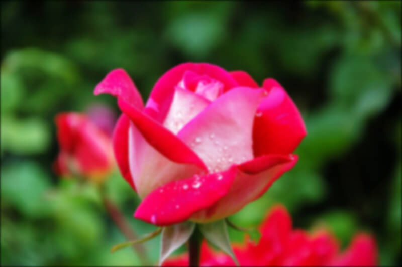
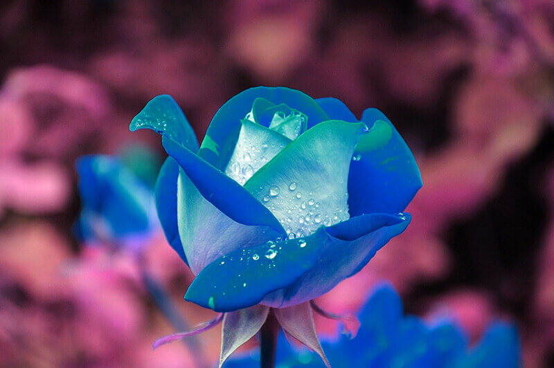
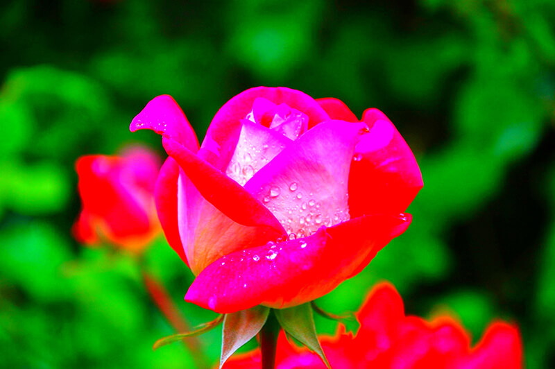
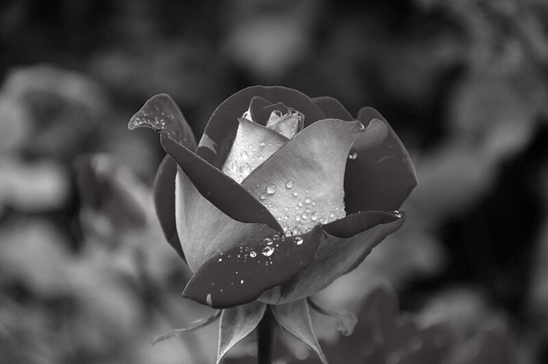
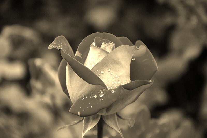
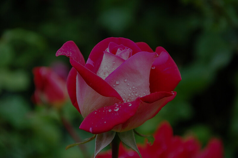
Most of the effect's intensity is calculated using either a percentage (like 29%), or its decimal equivalent (like 0.29). Other filters, like blur() can be calculated in pixel depth (like 5px), which we'll go into shortly for each filter, and display the expected output using this picture of a rose:

Brightness
The brightness() function defines the overall brightness or darkness of an image, making it appear less or more bright than its original version.
A value of 0% will display a completely black image, while a value of 100% will show the image unchanged, and a value of 200% will increase the image's brightness by twice the original amount.
filter: brightness(200%);
Contrast
The contrast() function adjusts the difference in luminance and color between the objects within the image, making them less or more distinguishable depending on the value passed in.
A value of 0% will display a completely grayed-out image, while a value of 100% will show the image unchanged, and a value of 200% doubles the image's contrast, increasing its luminance and color variations.
filter: contrast(200%);
Blur
The blur() function applies a Gaussian blur to the image, blending its pixels into each other, and providing a smoother output image versus a more defined, sharper image.
The value you pass into this function is calculated in pixels instead of percentages or decimals. So if you were to pass in a value of "5px", that means that each of the image's pixels within a 5 pixel radius defined would blend into each other throughout the entirety of the image, providing a smoother, but blurred output.
filter: blur(5px);
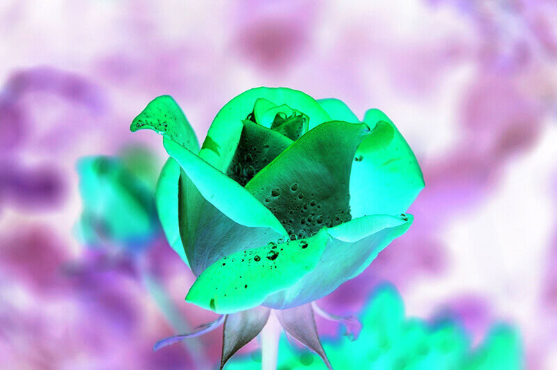
Hue
The hue-rotate() function alters each pixel color using an angle, defining the number of degrees around the color circle the image's pixels will be adjusted.
A value of "0deg", or 0 degrees, leaves the pixels completely unchanged, while a value of "180deg", or 180 degrees, would alter each of the image's pixels 180 degrees around the color circle. Values here can range anywhere from 0 to 360 degrees, or a full circle.
filter: hue-rotate(180deg);
Saturation
The saturate() function determines the depth or intensity of color presence within an image.
A value of 0% leaves the image completely unsaturated, removing the presence of color and converting it to a black and white image. A value of 100% leaves the image unchanged, and a value of 200% intensifies the color presence and intensity by twice the amount of the original image.
filter: saturate(200%);
Grayscale
The grayscale() function defines the color presence within each pixel of an image.
A value of 0% leaves the image pixels untouched, retaining their original color presence, while a value of 100% removes all color presence, displaying the image in a black and white format.
filter: grayscale(100%);
Sepia
The sepia() function applies a warm photographic print tone used in black and white photographs, generally resulting in dated black and white finish with red and brown shades.
A value of 0% leaves the image tones untouched, while a value of 100% applies a full-blown sepia effect on your image.
filter: sepia(100%);
Opacity
The opacity() function applies transparency to an image, or makes the image fully opaque.
A value of 0% means the image is completely transparent, or invisible, and cannot be seen, while a value of 100% means the image is completely opaque with no transparency and can be seen on the page.
filter: opacity(50%);
Many modern browsers will also accept the opacity property itself by using the following syntax in decimal format:
opacity: 0.50;
The difference between the two options is some browsers provide hardware acceleration for better performance with filters. In the "old" days, Internet Explorer would not accept the opacity property, while modern browsers would, so both were generally used together for full support.
Invert
The invert() function inverts all pixels within an image to their exact opposities in the RGB scale.
A value of 0% leave the image's pixels unchanged, while a value of 100% displays a complete inversion of all the image's pixel colors.
filter: invert(100%);
Assigning Multiple Filters
If you want to assign multiple filters to a single element or image, you need to do it within a single filter property:
filter: blur(5px) brightness(200%) contrast(150%);
Separating the filters into individual filter properties for each desired filter will not work, so make sure you use the above format.
Removing Filters
If you need to remove any existing filters from an element or image, you can do so with the following syntax:
filter: none;
Most elements or images will not have filters pre-defined in your code anywhere, unless you've defined them yourself or are using a third-party plugin that defines them, in which case this will override them.
Try Out My Online Photo Editor
I created a custom online photo editor that you can play around with yourself and get a feel for how each of the filters works. You can import your own custom images and adjust each of the filters using the built-in sliders or you can adjust the numeric values yourself in the input fields.
You can also download the photo editor code from GitHub, and update and use the components in your own applications as needed.
Conclusion
This article went into detail of each of the CSS filters you can use for effective online photo editing techniques within your online websites or applications.
We also briefly went into the available online demo and code you can download from the GitHub repository so you can easily tie in the filters yourself into your own projects as needed.
Written by: J. Rowe, Web Designer & Developer
Last Updated: March 18, 2024Created: September 08, 2020