CSS Text Gradient: Linear Animation
 CSS
CSS In this article, we'll create a linear animated text gradient with CSS that'll be sure to wow your website visitors. We'll choose two colors that will animate back and forth throughout your text and will work across all desktop and mobile browsers. Except for Internet Explorer. We don't do that stuff here.
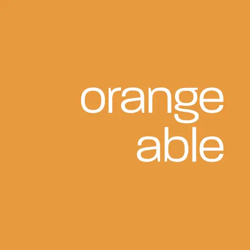
This is what it will look like!
The CSS
First, let's take a look at some CSS code for text gradients:
div.text {
	background: linear-gradient(-45deg, #6355a4, #6355a4, #e89a3e, #e89a3e);
	background-size: 300%;
	font-family: Arial, Helvetica, sans-serif;
	font-weight: 900;
	font-size: 5vw;
	letter-spacing: -5px;
	text-transform: uppercase;
	-webkit-background-clip: text;
	-webkit-text-fill-color: transparent;
	animation: animated_text 10s ease-in-out infinite;
	-moz-animation: animated_text 10s ease-in-out infinite;
	-webkit-animation: animated_text 10s ease-in-out infinite;
}

@keyframes animated_text {
	0% { background-position: 0px 50%; }
	50% { background-position: 100% 50%; }
	100% { background-position: 0px 50%; }
}
And the HTML code to display text in a div element with class text:
<div class="text">Orangeable</div>
The Explanation
We first start by creating a linear gradient background within our div element and a background-size of 300% to stretch three times the width of the element. This alone will create a solid gradient filling the entire container, so there are a few other CSS rules needed to achieve our desired effect.
Setting the -webkit-background-clip value to text clips the background so only the text within the element is affected. And setting the -webkit-text-fill-color value to transparent removed the text fill so any assigned solid colors are no longer visible.
We then create a keyframe animation that will repeat itself every ten seconds and run infinitely, shifting the background position from left to right and back again through a full cycle.
Conclusion
In this article, we covered the basics of creating a linear animated text gradient with CSS that works across all browsers. Have fun playing around with different colors and gradient effects to make your website fun and exciting!
Written by: J. Rowe, Web Designer & Developer
Last Updated: January 30, 2023Created: September 27, 2021