CSS z-index Property
 CSS
CSS On most web pages, we're used to seeing tons of HTML elements laid out on the horizontal and vertical planes, also known as the x-axis and y-axis. This gives visitors top-down, left-to-right visibility of their web page, similar to reading a book. All elements are displayed in the sequence they are written in the code in this fashion.
In this tutorial, we'll break into the third dimension by layering 2D elements with the CSS z-index property.
What is the z-index Property?
The z-index property in CSS controls the stacking order of HTML elements on the z-axis. Although the elements don't look closer to us visibly, the idea is that the HTML elements can be stacked, or layered, in a way that can produce some useful and pretty awesome effects.
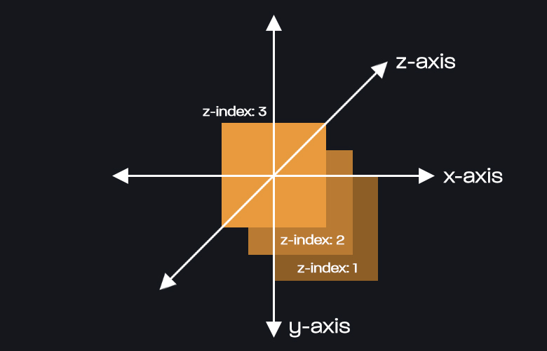
The following graphic illustrates the z-index property at work, layering three orange squares on the z-axis. The larger the value, the higher up on the z-axis the element is:
The z-index property in CSS is a great solution for fixed headers that you want to overlap page contents while scrolling down a page. It can also be used for some stunning visual effects if done correctly.
How to Use the z-index Property
The following code snippet displays two div elements on the page, each with a different z-index value:
div#item-1 {
	position: relative;
	z-index: 11;
}

div#item-2 {
	position: relative;
	z-index: 10;
}
Visually, this code will just display two elements in sequence from top to bottom without an overlap. In reality, the item-1 element will be one layer above item-2 on the z-axis. This is because the z-index value of item-1 is 1 larger than the other element.
As an example, if we were to offset the position of the second element so they both overlap, we could add some additional styling, like background colors, that illustrates the overlap:
div#item-1 {
	width: 100px;
	height: 100px;
	background-color: red;
	position: relative;
	z-index: 11;
}

div#item-2 {
	width: 100px;
	height: 100px;
	background-color: blue;
	position: relative;
	top: -100px;
	left: 50px;
	z-index: 10;
}
Now, the red element covers half of the blue element because the z-index value of the red element is higher:
The values forz-indexmust be a positive or negative integer value, maxing out at +/-2147483647. In my personal opinion, I believe it's lazy to go above 100 forz-indexvalues unless you truly have that many elements layered on a page. It's best practice to keep track of which elements are layered so you can use smaller, more readable values.
z-index with Positioned Elements
You'll notice above that both of the elements had an additional CSS rule of position: relative. That's because, for z-index to work at all, you must set a value to this property. Otherwise, the layering gets ignored entirely.
All valid position property values that you can use include relative, absolute, fixed, static, and sticky.
Sibling Rivalry
Another thing you will notice is the z-index property only works with sibling elements. This means that you can't have an element standing on its own interact on the z-axis with a child element of another element.
Here's a simple way to illustrate this with a simple HTML code snippet:
<div id="item-1">
	<div id="item-2"></div>
	<div id="item-3"></div>
</div>
<div id="item-4"></div>
And some CSS for styling:
div#item-1 {
	position: relative;
	z-index: 13;
}

div#item-2 {
	position: relative;
	z-index: 12;
}

div#item-3 {
	position: relative;
	z-index: 11;
}

div#item-4 {
	position: relative;
	z-index: 10;
}
Now, if we were to set a different z-index value for each of these four elements, the layering would work like this:
item-1could overlapitem-4, but notitem-2oritem-3, because those two elements are its own child elements.- Similarly,
item-4cannot overlap any of the other elements, becauseitem-1is the parent element with a largerz-indexvalue.
Conclusion
In conclusion, the CSS z-index property is a great solution when overlapping elements on the z-axis. Get creative with it and try some different designs. You'll get good with using it quickly and will be on your way to creating some visually stunning web pages!
Written by: J. Rowe, Web Designer & Developer
Last Updated: August 29, 2022Created: May 20, 2021